top of page
UI/UX Refinement
of Westgate Reservations
UI elevation and Design System creation

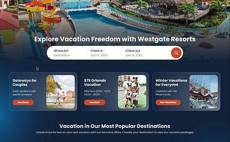


The Problem
The website no longer reflected the resort's modern aesthetic or revenue goals. We redesigned the experience to eliminate friction and strategically elevate special deals across the guest journey.
My Process
1
Research
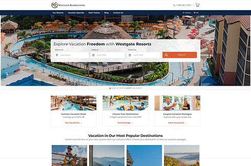
Before changing a single pixel, we took a deep dive into the original site to understand its foundation. We analyzed every page by deconstructing existing colors, layouts, and visual hierarchies. We wanted to keep what was working, discard what was outdated, and set a clear direction for a modern refresh.
Wireframes
With a clear vision in mind, we built the site's new skeletal structure through low-fidelity wireframes. This step was all about layout and strategy, placing key elements purposefully to eliminate friction, optimize user flows, and make navigation completely effortless.
.png)
2

3
Design Decisions
In the final design stage, we got to be creative as we brought the website to life. We experimented with bold color choices, sleek widgets, and intentional visual cues designed to capture user attention and guide them toward key actions. This is where we refined every visual element until it felt aligned with the brand.
Key Redesign Highlights
- HOME PAGE -
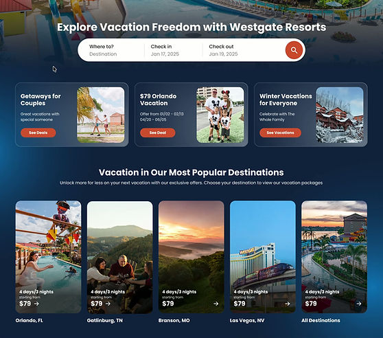
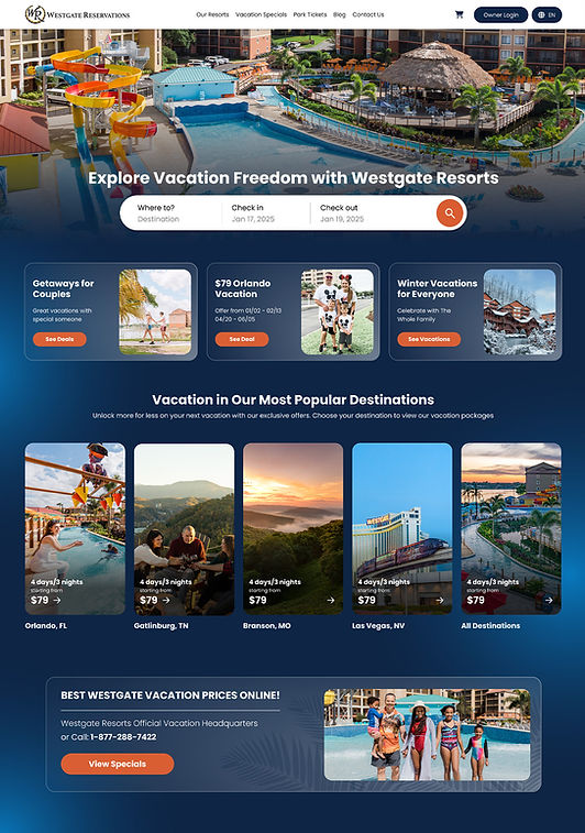
Sleek booking widget
We created a responsive web experience to elevate the brand's identity, through the use of dynamic light and hover animations.
Hover animations to reward user interaction

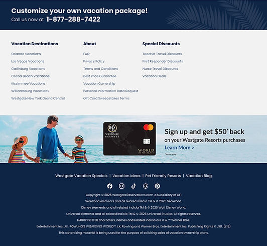
Old Website:
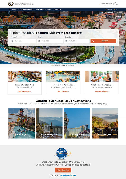
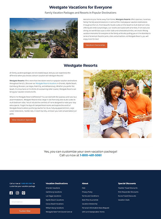

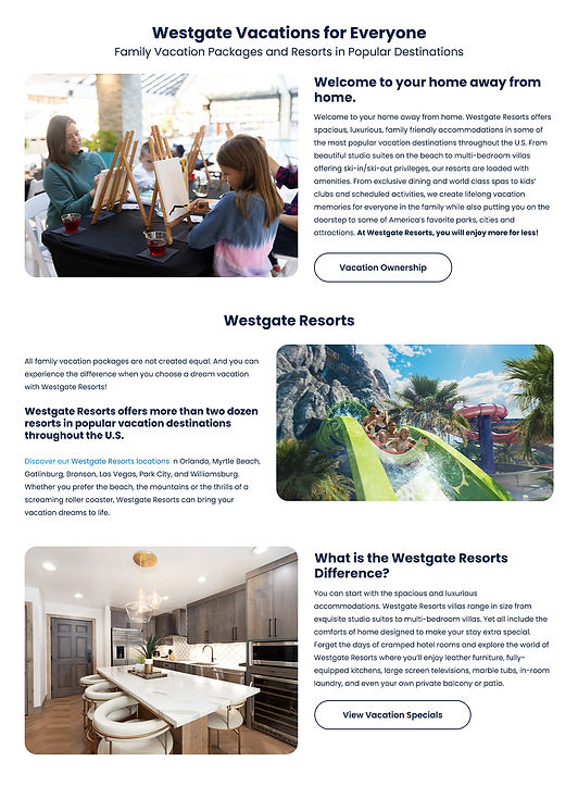
New Version:
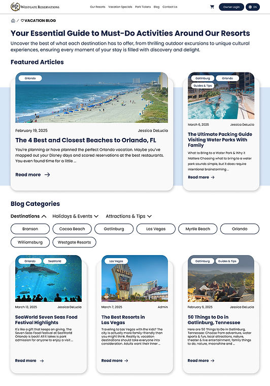
- BLOG PAGE -
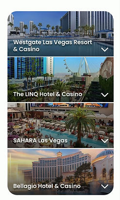
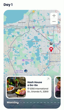
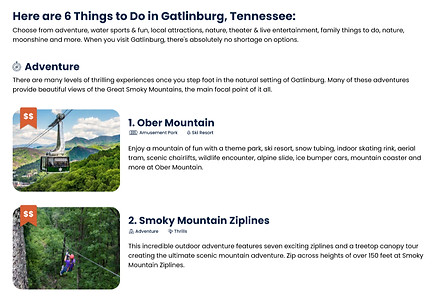
A fun creative hurdle was breathing new life into standard content.
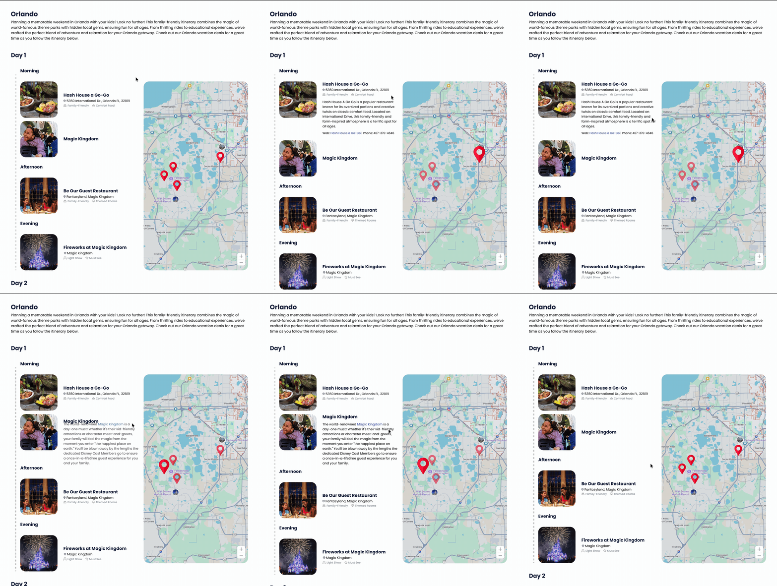
We turned traditionally dry elements, such as maps and dense information tables, into dynamic, interactive experiences.
Interactive map
Icons as visual anchors
Old Website:

New Layout:
- CITY SPECIFIC DEALS PAGE -
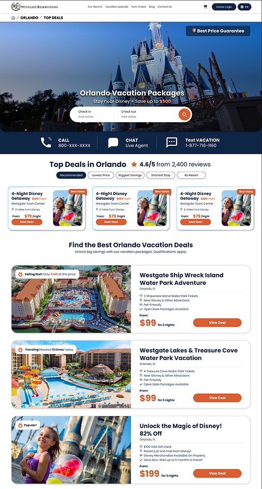

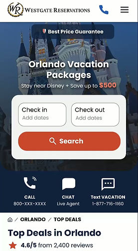
Optimal performance across all screens
Creating subtle urgency
- RESORT PAGE -
Old Website:
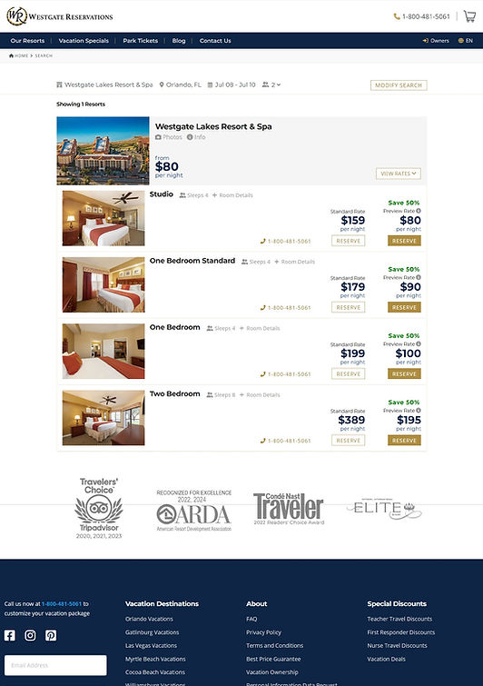
New Version:

Design System
We established a design system to accelerate our production workflow and maximize asset reuse. Any future design tweaks or system updates only needed to be applied to the master assets, keeping the entire project scalable and cohesive.
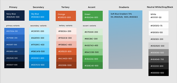
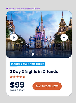
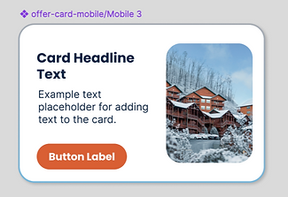
We defined standardized rules for core components like cards and buttons, establishing color values for primary actions, surfaces, and interactive states.
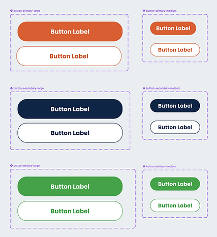

Developer Handoff
Once the final designs were approved, we prepared the files for development by documenting key design specifications and ensuring all components were clearly defined. We provided developers with details such as spacing, typography, colors, dimensions, states, and responsive behavior, along with reusable component specifications to keep the implementation consistent.
The handoff also included reviewing the designs together, answering questions, and clarifying interactions before development began.
The Impact
By reimagining the site's structure, establishing a design system, and bringing static content to life with interactions, we transformed an outdated platform into a high-performing digital experience. The result is a cohesive, modern website built to engage users on every device and scale effortlessly alongside the brand.
At the end of the day, it wasn't just about making the site look prettier, it was about making it actually feel good to use. The final result feels way more alive, holds people's attention, and sets the brand up for what's next.

bottom of page